
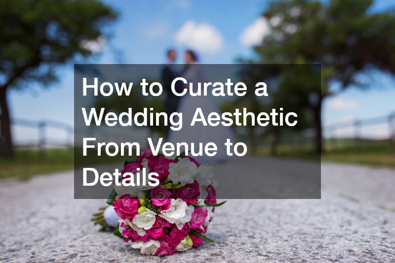
A wedding aesthetic is not a mood board. It is a series of interdependent decisions — venue architecture, lighting, textiles, florals, stationery, attire — that either reinforce each other or quietly undermine each other. Couples who approach the process as a series of isolated vendor bookings often end up with a day that feels fragmented on camera and in person. The ones who get it right treat aesthetic curation as a design problem: identify a core visual language first, then filter every subsequent decision through it.
Starting With a Visual Language, Not a Theme
Themes are limiting. “Garden party” or “black tie glamour” tells vendors what props to pull, but a visual language tells them how the whole day should feel. The difference matters practically: a visual language covers light quality, texture contrast, color temperature, and spatial proportion — elements that themes ignore.
Start by identifying three to five adjectives that describe the atmosphere you want guests to experience, then translate each one into a design element. “Warm” might mean amber candlelight and aged brass hardware rather than chrome or white LED. “Layered” might mean combining linen napkins, textured charger plates, and trailing foliage rather than a single-fabric tablescape. “Quiet” might mean negative space — fewer florals, wider table spacing, muted tones.
Before booking a single vendor, collect reference images and sort them ruthlessly. If a pin-board has 80 images, cut it to 20. The 20 that survive represent the actual aesthetic. The 60 you cut are aspirational noise.
Venue Selection as the Aesthetic Foundation
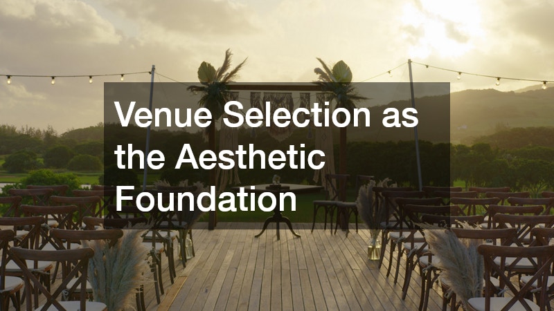
Every decision made after booking a venue either works with the architecture or fights it. This is the most expensive mistake couples make — falling in love with a venue for its reputation or location, then spending thousands trying to transform a space that resists the intended look.
A raw industrial warehouse is genuinely difficult to make feel romantic without substantial draping and lighting investment, which can run $4,000 to $8,000 for a mid-size event. A formal estate venue with ornate millwork will resist minimalist Scandinavian styling no matter how restrained the florals are. The architecture always wins.
When evaluating venues, bring your three to five adjectives and assess structural fit before pricing. Ask to see the space in the lighting conditions it will actually be used — afternoon reception light in a barn is different from the evening candle-lit version the photographer will capture. Walk the ceremony-to-reception transition path and assess whether the visual shift feels intentional or jarring.
For couples choosing between a venue with strong character versus a neutral blank-canvas space: a character venue reduces decor spend because the architecture carries weight, but it also restricts aesthetic flexibility. A blank canvas gives complete control but requires a larger decor budget to avoid looking sparse. Neither is objectively better — the right answer depends on whether the intended aesthetic leans into or against the space.
Building Cohesion Through a Color and Texture System
Color palettes in weddings are typically discussed in terms of flower varieties and stationery ink, but the real test of cohesion is whether the palette holds across every surface — linens, cake, ribbons, bridal party attire, candles, and menu card stock.
Work with a base of two to three primary colors and one or two accent tones. The primary colors should appear in high-volume elements (linens, florals, attire). Accent tones appear in small, repeating details — wax seals, ribbon on favors, the inner envelope liner.
Texture is the variable most couples underestimate. A palette of ivory and sage reads entirely differently when expressed in silk charmeuse versus matte crepe versus textured linen. Before finalizing any rentals or fabric orders, request physical swatches and compare them in the venue’s lighting conditions. Two ivory swatches that look identical on a phone screen can read as clashing shades under warm candlelight.
A practical system: assign each color a dominant texture and a secondary texture. Dusty rose in silk charmeuse (dominant) and velvet ribbon (secondary). Sage in dried pampas (dominant) and painted ceramic (secondary). This structure prevents the palette from feeling flat while avoiding visual chaos.
Florals, Stationery, and the Details That Do the Most Work
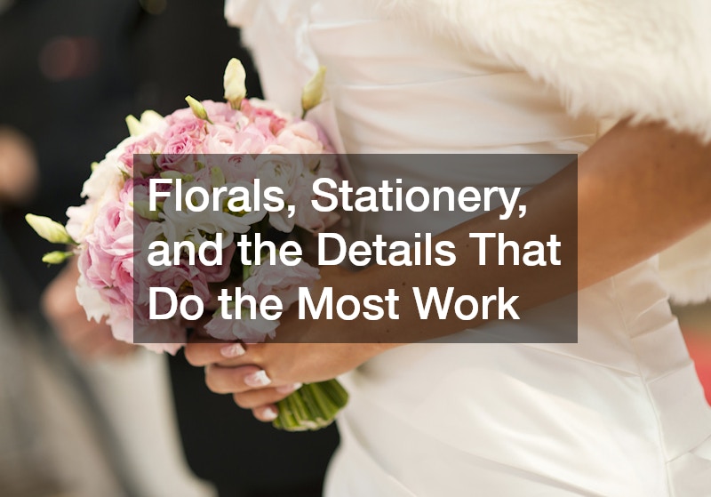
Florals consume a significant portion of wedding budgets — often 8 to 15 percent of total spend — and they do their best work when they reinforce texture and scale decisions already made elsewhere, not when they are treated as independent showpieces.
Brief your floral designer with your adjective list and your texture system, not just a color palette. A florist told “dusty rose and sage” will make choices based on their own aesthetic instincts. A florist told “warm, layered, quiet — lots of dried texture mixed with soft garden roses, minimal greenery filler” will produce something aligned with the larger design intent.
Stationery is the first physical object guests interact with before the wedding day, and it sets expectations. The paper stock, font weight, printing method, and envelope color should all register as consistent with the venue and decor direction. Letterpress on heavy cotton stock signals a different aesthetic than digital printing on smooth cardstock — both are legitimate choices, but they carry different visual weight.
On the day itself, documentary wedding photographers capture the details that couples spend months selecting but often forget to brief vendors on specifically — cake texture, ribbon placement on chair backs, the ceremony backdrop at full candle height. Create a shot list of detail elements and share it with your photographer at least two weeks before the event.
Attire as Aesthetic Architecture
Bridal and party attire is the only element of a wedding that moves through every space and appears in nearly every photograph. It should be selected in direct conversation with the venue and palette decisions, not in isolation at a bridal appointment months before other elements are confirmed.
The key comparison most couples face is between a gown that photographs beautifully versus one that reads well in person. A heavily beaded ballgown with significant structure photographs with drama but can feel visually disconnected from an organic, textured garden aesthetic. A fluid bias-cut silk looks cohesive in an intimate stone courtyard but may read as shapeless in a large formal ballroom with a high ceiling.
For bridal party attire, the question of uniform versus coordinated-but-varied deserves a real decision framework. Uniform attire (identical style and color) creates strong visual symmetry and photographs cleanly. Coordinated-but-varied (same color family, different silhouettes) reads as more relaxed and suits organic or bohemian aesthetics. Mixed-tone palettes — where each person wears a different shade within a related color family — require careful curation to avoid looking like an afterthought, but when executed well, they photograph with depth.
How to Lock In the Aesthetic Before the Final Weeks
The point at which an aesthetic either holds together or falls apart is typically four to six weeks before the wedding, when final vendor confirmations happen simultaneously. Florals get confirmed, rentals are finalized, and any gaps in cohesion become visible for the first time.
Build a one-page visual brief — actual printed swatches, a trimmed reference image, and the adjective list — and distribute it to every vendor at contract signing, not at the final meeting. This gives vendors time to raise concerns and make adjustments before their ordering windows close.
Schedule a venue walkthrough at the six-week mark with your planner or a trusted eye, specifically to assess whether confirmed elements work together in the actual space. Problems identified here — a rental chair color that reads orange under the venue’s Edison bulbs rather than the intended warm wood tone — are still fixable. At two weeks out, they are not.
Committing to the Aesthetic on the Day Itself
The final detail couples rarely plan for is the aesthetic discipline required on the wedding day. Last-minute additions — a well-meaning family member’s floral arrangement in a clashing style, a card table covered in a tablecloth from a different rental order — can disrupt a carefully curated look in ways that are permanent in photographs.
Designate one person, ideally the planner or a detail-oriented member of the wedding party, with authority to make visual calls on the day. Give them the one-page brief. Their job is simple: if something does not match the brief, it does not appear in the ceremony or reception space. That single role, filled by the right person, is often what separates a coherent wedding aesthetic from one that almost got there.